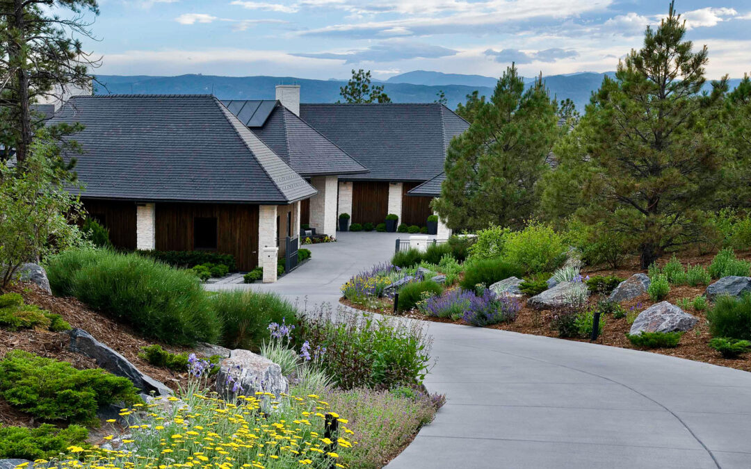
At Lifescape Colorado, we are always looking for ways to improve, grow and develop in everything we do. So, we felt it was time to refresh our brand identity a bit. You’ll notice that we have recently implemented a freshly updated logo and other branded materials. The new look is not a radical change of direction, but more of a refinement of how we have already been presenting our brand to our clients and community. We love the updated look and hope you do too!
![]() The Logo
The Logo
You’ll notice first that the black background from our old logo has been replaced with a crisp white background. The distinctive red square remains an important element. To share some history, the founder of Lifescape, a highly acclaimed local landscape architect, was so design centric that he wanted to use Frank Loyd Wright’s signature red square in the Lifescape logo to symbolize the company’s commitment to excellence in design.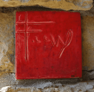
The shapes created within the red square are intended to mean different things to different people. As our company has grown from a handful of employees to 100+, the layers in the red square represent the depth in our talent and the divisions of our company from design to construction to maintenance. The new design within the red square was chosen because of its connection to some iconic pieces of art in the Denver Art Museum’s permanent collection. 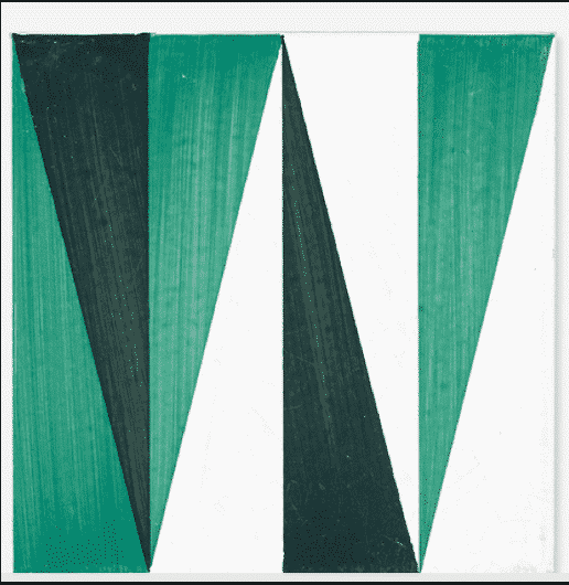
There is of course, also a reference to landscape in the design. Some see mountains, others feel it looks like layers of the earth and many spot an ‘L’ for Lifescape. We are thrilled to have the new logo design inspire so many different reference points. Our commitment to excellence in design, construction and maintenance is inspired by endless reference points in nature, our clients and the design community around us.
The new logo was custom designed by Lewis Dante, a designer with close personal connection to the Lifescape team, giving him the unique ability to create a symbol that could represent both the past and future of the company.
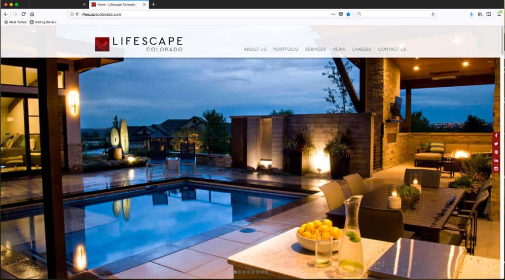
The Website
As part of our brand update, we have taken particular care in re-imagining our website from the ground up. Again, a lighter, brighter feel has been implemented along with an easier navigation. Full screen photos now provide a better overview of our work and inspiration for clients or visitors who are looking for a variety of possibilities for their own creative projects. We are proud of our work and accomplishments and felt like they should be front and center!
Trucks, print materials and more.
It’s a big undertaking to change and grow, but we have never shied away from big projects or opportunities to do something better. You’ll see our new look on everything from our trucks and trailers to our business cards and signs.
What hasn’t changed?
Our commitment to excellence and our client-centered focus on service will never change. Our mission is to create and maintain sustainable outdoor spaces that enrich the lives of our clients, enhance the natural beauty of our community and conserve the resources of our planet. These parts of our brand identity are just where they need to be.